


Search Engine Optimization, Online Reputation Management and Social Media Marketing that actually build your brand.
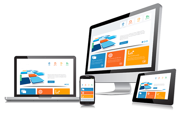
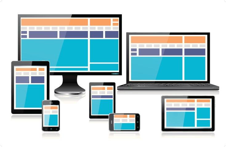
GET A STUNNING WEBSITE THAT LOOKS PERFECT ON ALL DEVICES
PERFECTLY RESPONSIVE WEBSITE DESIGN IMPROVES THE VIEWING EXPERIENCE, RESULTING IN HIGHER CUSTOMER ENGAGEMENT AND MORE CONVERSIONS
Anywhere, Any Device
iPhones, Androids, tablets, computers, monitors, you name it. Responsive web design will make your website versatile for any device to view on. Even wearable devices like smartwatches will be able to format your web design and display information from your site.
Latest Technology
As an experienced responsive web design agency, we employ the latest tech and cutting-edge practices to build and create beautiful and functional responsive websites for each of our clients. You know you’re getting the best, because we only use the best technologies as we build.
Fast and Sharp
Responsive web design services go hand-in-hand with sleek style and modern web design. No more chunky graphics and buttons unaligned with text in the middle of the page; your design loads easily for visitors to enjoy.
Compact and Efficient
The current trend is a shift toward mobile-first design, and Google requires your website to be mobile-device-friendly for optimum search rank. We strategically compact all the information you need within the constraints of responsive containers to ensure your visitors see your content in perfectly readable, usable format..
100% Current Code
We only use the most versatile and refined programming environments and languages to build your responsive website. Languages like CSS3 and HTML5 have long since replaced relics of web programming that are unfortunately still in use on a majority of websites that don't feature automatic webpage sizing and flexible media retrieval.
Optimized Images
As the size of the screen on which your responsive web site is viewed, so do the images. They automatically reformat and size themselves to fit neatly into the screen. Whether it’s a web browsing window that’s being moved and resized or switching to a phone screen, the images are still clear with high-resolution.
“Mobile-Friendly" vs “Responsive"
Mobile-Friendly simply means that your website's content and images are accessible, legible and usable to visitors on a smartphone.
But how many times do you find yourself on a website that doesn't display very well on your smartphone screen? A website where you have to pinch-and-zoom to read smaller text or access buttons and other links that are too close to other elements?
In the past, many companies tried to make their website mobile-friendly by electing to build a separate mobile version of their site to go along with the desktop version. Today, building a single Perfectly Responsive Website is the new industry standard.
The Benefits of Custom Responsive Website Design Services
- Google has officially stated that they prefer responsive websites.
- You only have to manage one website when it’s responsive, as opposed to having to manage both a desktop version and a mobile version.
- You won’t have to worry about duplicate content, faulty redirects or other common usability errors that a separate mobile website can create.
- Responsive websites offer the best usability for your visitors as they’re compatible to ALL users on ALL devices.
WE'RE READY TO WORK OUR MAGIC FOR YOU
SUBSCRIBE NOW WITH NO CONTRACTS OR SET-UP FEES
Our services are offered for a very competitive monthly rate with no contracts or term commitments and no set-up fees. We don't need to lock clients into a long-term contract to keep their business...our clients stay with us year after year because our services actually work.

Local Online Marketing Subscriptions
From: $129.95 / month