


Search Engine Optimization, Online Reputation Management and Social Media Marketing that actually build your brand.
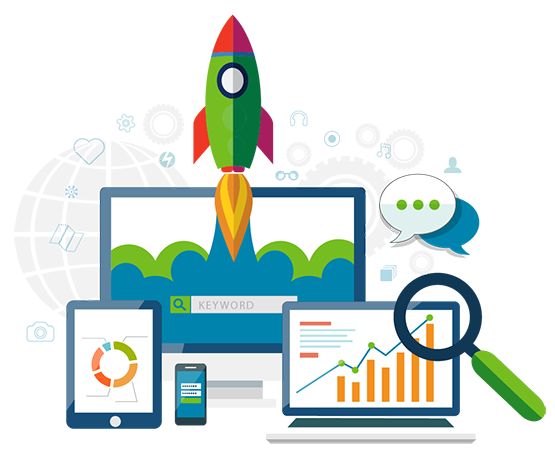
Digital Marketing for Small Business, Multi-Location Chains & Franchisees
We are an award-winning Local Online Marketing Agency that partners with Google, Facebook, Instagram, Twitter and Linkedin to deliver the BEST local online marketing services in the world.
As an independent agency that partners with all of the top search engines and social platforms, we’re uniquely positioned to deliver exceptional results with a proactive, invested approach to success.
We deliver a full complement of digital marketing services:
Local Search Engine Optimization
Our Local SEO optimizes your Google Business Profile listing to appear most often in local search results when customers near you search for your products and services.
Local SEO 
Social BOOSTER
Positive review catalyst and negative review mitigator with reputation management ensures that your social reviews are optimized for maximum benefit to your online reputation.
Social BOOSTER 
Social Media Management
Our SMM is based on extensive experience and a track record of designing and implementing highly effective social campaigns for businesses in dozens of different industries.
Social Media Management 
Pay-Per-Click (PPC) Ads Management
PPC ads deliver instant traffic with high conversion rates and are a very effective way to compliment to your local and organic SEO campaigns.
PPC Ads Management 
Perfectly Responsive Websites
When customers search for your products & services, we make sure your website is PERFECT on every device.
Perfectly Responsive Websites 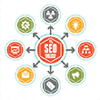
Global Search Engine Optimization
If you sell outside your local area, we can expand your reach by optimizing your site to appear at the top of organic search results as well.
Global SEO 
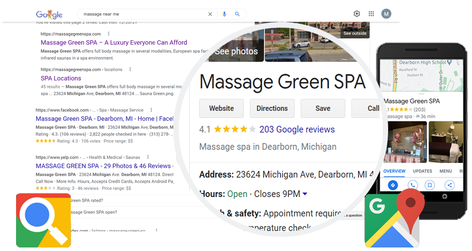
Where does your business rank in local search? And why?
Are potential customers finding you, or are they finding your competitors?
Our clients tell the story of our mutual success.
We trust our local SEO to Breakout exclusively. After trying other providers who delivered lukewarm results, Michael and his team took over and we finally achieved top local search rankings that increased the traffic to our locations. We're a multi-location franchisee of a national brand and we've also heard that many other franchisees are having similar success with Breakout's services as well. To this day we outperform our much larger competitors in local Google search, so we highly recommend Breakout to any business looking to do well in local search results.
Breakout Internet Media does an extraordinary job of serving the day to day needs of our franchisees and corporate franchise locations. The Breakout team finds a way to keep costs low, responsiveness high and consistency in local SEO results even higher. We appreciate that Breakout also stays on top of the frequent Google algorithm changes that constantly alter the digital marketing landscape and keep us up to date on strategies to deal with those changes.
Michael Berry and his team at Breakout Media have been handling all my SEO and other internet marketing for the past few years for both my spa locations and we immediately saw a big increase in the number of calls to our locations after they took over. They have helped us tremendously with all our Social media marketing and posts and have really helped us to be more visible online when clients are looking for massage, facial and sauna services. They constantly monitor our websites and Google positioning and help us to improve our visibility. It's great to have someone who handles this for us so we can focus on running the businesses. I highly recommend Breakout Media for all your SEO and social media marketing!
We've helped hundreds of small business owners, franchisees and
enterprise CEO's dominate their local competitors online.
enterprise CEO's dominate their local competitors online.


OUTPERFORM COMPETITORS IN LOCAL AND ORGANIC SEARCH
Stand out from your competition with better rankings, better reviews, better recommendations, more check-ins, more photos, special offers, featured products & services and much more of everything else that gives you dominance in your local online market!
Our services are specifically engineered to improve your online presence, and we’re constantly using the data, metrics and KPI’s we gather managing hundreds of listings to improve our understanding and fine-tune our strategies to maximize opportunities provided by platform algorithms…always following our goal of helping to bring you more customers and grow your business.
Our services are specifically engineered to improve your online presence, and we’re constantly using the data, metrics and KPI’s we gather managing hundreds of listings to improve our understanding and fine-tune our strategies to maximize opportunities provided by platform algorithms…always following our goal of helping to bring you more customers and grow your business.
SUBSCRIBE NOW WITH NO CONTRACTS OR SET-UP FEES
Our services are offered for a very competitive monthly rate with no contracts or term commitments and no set-up fees. We don't need to lock clients into a long-term contract to keep their business...our clients stay with us year after year because our services actually work.

Local Online Marketing Subscriptions
From: $129.95 / month